Storytelling comes naturally to marketers and advertising folks, but the dynamics are now changing. More and more decisions are being taken based on data. Today companies are amassing more data than ever before. Amazon, Flipkart and retailers are tracking average basket size, frequency of purchase, garment size, units, colours, designs, patterns, etc. airlines are using dynamic pricing for different websites, devices, time zones, cities, countries, etc. Auto companies using IoT are tracking our cars continuously and just about every call, email, and social media interaction is being tracked. This enables organisations to solve customer needs, problems and helps improve service. Decision making in today’s world is increasingly relying on data, which is coming at us with great velocity and volume. It’s not easy to comprehend it without some layer of storytelling.
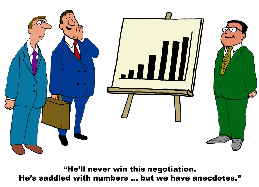
Companies are spending a fortune on collecting data but are getting back only a fraction of this investment. The problem is that most companies do not invest in or train their people to interpret and communicate data in a meaningful manner. In most cases people who are tasked with exploring data for insights put up data in some graphs and slides and quickly mail it or delegate it upwards to their seniors to make sense of it and more importantly take a position on it. This is the difference between a gatherer and a disseminator. Data professionals need to be trained to move from exploring data to explaining data. From being right about data to showing the right way with data is a journey that is proving to be the most difficult for organisations. For data to help initiate action will require more than accuracy, it will have to make logical sense. Articulation of data is the need of the hour. The ability and the professional training required to have the courage of conviction to communicate a point of view on data is the key. Senior management and decision makers want to cut to the chase quickly not meander through slides and slides of data.
There certainly is a gap in terms of ability to ask the right questions, understand which data is relevant, how to test the validity of the data, interpret the data to provide meaningful outcomes and create easy to comprehend visualisations giving the big picture to leadership teams. A few key questions that will help data science professionals to narrate a compelling story that will engage and add value to senior management decision making:
- How does one contextualise data?
- How does one create meaning out of data?
- How does one corelate disparate data points?
- How does one get to the most important point quickly?
- How does one present a meaningful business hypothesis?
- How does one simulate an effective visual representation?
While I am saying all this, let’s also acknowledge the fact that this is not a new-age technology world problem. More than 100 years ago, Willard Brinton in his book Graphic Methods for Presenting Facts stated – “Time after time it happens that some ignorant or presumptuous member of a committee or a board of directors will upset the carefully-thought-out plan of a man who knows the facts, simply because the man with the facts cannot present his facts readily enough to overcome the opposition. As the cathedral is to its foundation so is an effective presentation of facts to the data.”
One of the reasons for this problem to have taken a monumental proportion is the fact that data analysis tools come bundled with data visualisation tools and a natural expectation because of that has been that the same person should be able to analyse, interpret, visualise and communicate the data story effectively. Over the last few years organisations have been in a mad rush to recruit data scientists with deep technical skills and almost none with data story telling skills. Organisations cannot leave the task of teaching this skill to academic institutions. They will have to train their resources just like Hansa Cequity is doing to ensure that the plot is not lost in a heap of slides! The future belongs to professionals with the ability to interpret and communicate the data story impactfully and compellingly, enabling decision-making at the highest level easier.